
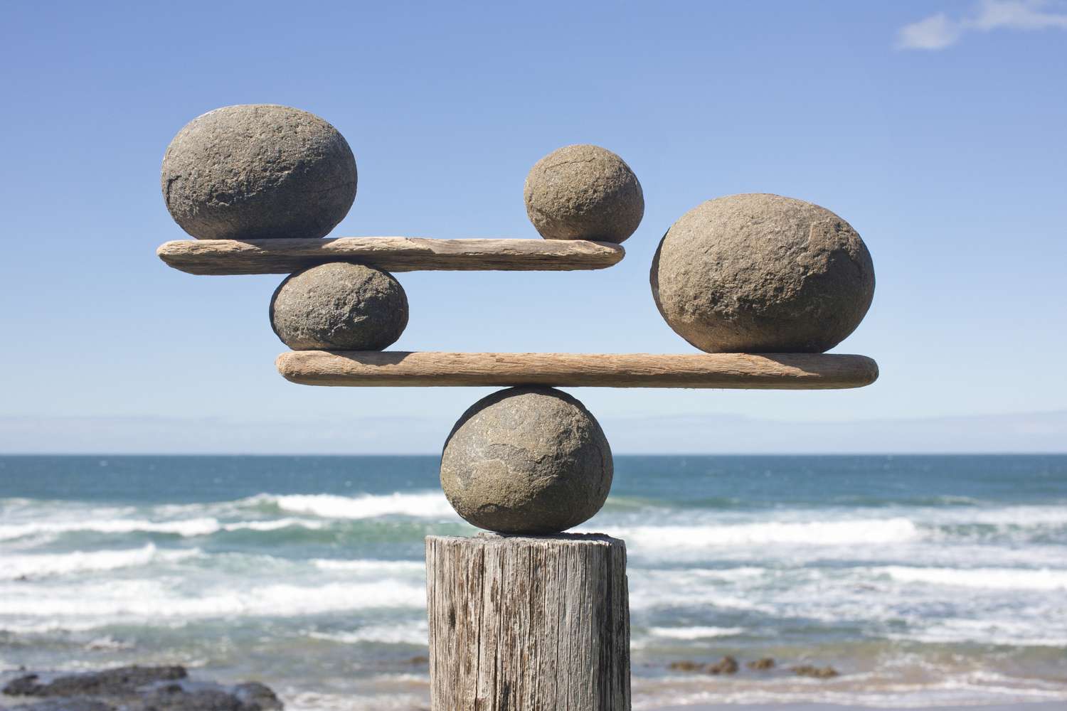
Balance is the unsung hero of design, the quiet force that holds everything together. Whether you’re designing a website, a poster, or your living room, balance ensures harmony, guiding the viewer’s eye without overwhelming them. I remember my first attempt at designing a flyer for a local bake sale—too many fonts, clashing colors, and a chaotic layout that looked like a sugar-fueled toddler had taken over. It was a mess! Learning about balance transformed my approach, and I’m excited to share how it can do the same for you.
What Is Balance in Design?
Balance in design refers to the distribution of visual weight in a composition. It’s about arranging elements so no single part overpowers the rest, creating a sense of stability. Think of it like a seesaw: too much weight on one side, and the whole thing tips over.
Why Balance Matters
Without balance, a design feels chaotic or unsettling. It’s like walking into a room where all the furniture is crammed into one corner. Balance ensures your design feels cohesive, guiding the viewer’s eye smoothly across the composition.
Types of Balance in Design
There are three main types of balance: symmetrical, asymmetrical, and radial. Each has its own vibe and purpose, and choosing the right one depends on the mood you’re aiming for. Let’s break them down.
Symmetrical Balance
Symmetrical balance is like a mirror: elements on one side of the design reflect those on the other. It’s orderly and formal, often used in traditional or professional designs. Think of a classic wedding invitation with centered text and matching flourishes.
Asymmetrical Balance
Asymmetrical balance uses different elements with varying visual weights to create harmony. It’s dynamic and modern, like a website with a bold image on one side offset by smaller text on the other. It feels lively yet still cohesive.
Radial Balance
Radial balance radiates from a central point, like spokes on a wheel. It’s less common but striking, often used in logos or circular patterns. Imagine a mandala or a clock face where elements spiral outward.
How to Achieve Balance in Your Designs
Achieving balance isn’t about rigid rules; it’s about trusting your eye and understanding how elements interact. I once redesigned a café menu that was so cluttered, customers couldn’t find the specials. By applying balance principles, I made it inviting and easy to read. Here’s how you can do it too.
Use a Grid System
Grids are your best friend for maintaining balance. They act like an invisible scaffold, ensuring elements align properly. Tools like Adobe XD or Figma offer grid templates to keep your layout structured.
Consider Visual Weight
Visual weight is how much an element draws attention. Bright colors, large sizes, or bold textures feel “heavier.” Spread these elements thoughtfully to avoid a lopsided design.
Play with Negative Space
Negative space, or the empty areas in a design, is just as important as the elements themselves. It gives the viewer’s eye a break and prevents clutter. Think of Google’s homepage—minimal yet perfectly balanced.
Experiment with Scale and Proportion
Mixing large and small elements creates visual interest while maintaining balance. A large headline paired with smaller body text can guide attention without overwhelming the viewer.
Comparing Types of Balance
| Type | Characteristics | Best Use Cases | Challenges |
|---|---|---|---|
| Symmetrical | Mirrored elements, formal, stable | Logos, formal invitations, architecture | Can feel static or predictable |
| Asymmetrical | Varied elements, dynamic, modern | Websites, posters, casual branding | Requires careful visual weight balancing |
| Radial | Circular, radiating from a center point | Logos, decorative patterns, infographics | Limited to circular or spiral layouts |
This table highlights how each type suits different projects. For example, a corporate website might lean symmetrical for professionalism, while a creative portfolio could thrive on asymmetrical flair.
Pros and Cons of Balanced Design
Pros
- Clarity: Balanced designs are easy to navigate, making information accessible.
- Aesthetic Appeal: Harmony creates a pleasing experience, keeping viewers engaged.
- Versatility: Works across mediums, from print to digital.
- Professionalism: Signals attention to detail, boosting credibility.
Cons
- Time-Intensive: Achieving balance requires careful planning and tweaking.
- Risk of Monotony: Overly balanced designs can feel predictable if not paired with creative flair.
- Complexity in Asymmetry: Asymmetrical balance can be tricky to master without practice.
Tools and Resources for Mastering Balance
To nail balance in your designs, you need the right tools and inspiration. Here are some go-to resources that I’ve found invaluable over the years.
Best Tools for Balanced Design
- Canva: Offers grid-based templates for beginners to create balanced layouts. Try Canva.
- Adobe XD: Perfect for professionals designing websites or apps with precise grids.
- Figma: Collaborative and versatile, with plugins for balance-focused design. Explore Figma.
- Grid Calculator Pro: A plugin for creating custom grids to ensure perfect alignment.
Where to Find Inspiration
- Behance: Browse professional portfolios for balanced design examples. Visit Behance.
- Dribbble: A community of designers sharing creative, balanced layouts.
- Pinterest: Search for “design balance” to find visual inspiration for any project.
People Also Ask (PAA)
What is balance in design?
Balance in design is the distribution of visual weight to create harmony. It ensures no part of the composition feels too heavy or empty, guiding the viewer’s eye smoothly. Think of it as the equilibrium that makes a design feel “right.”
Why is balance important in design?
Balance creates a sense of stability and professionalism. It makes designs easy to understand and visually appealing, whether it’s a website or a poster. Without it, viewers might feel confused or overwhelmed.
What are the types of balance in design?
The three main types are symmetrical (mirrored elements), asymmetrical (varied elements with equal visual weight), and radial (elements radiating from a center). Each suits different design goals, from formal to dynamic.
How do you achieve balance in graphic design?
Use grids, play with visual weight, and embrace negative space. Tools like Figma or Canva can help, while experimenting with scale and proportion adds interest. Practice and feedback refine your sense of balance.
Practical Tips for Beginners
When I started designing, I was overwhelmed by the idea of balance. My early posters looked like a jigsaw puzzle gone wrong! Here are some tips that helped me improve:
- Start Simple: Begin with symmetrical balance—it’s easier to control.
- Use Reference Points: Align elements to a grid or central axis.
- Step Back: View your design from a distance or zoom out to check overall balance.
- Get Feedback: Share your work with friends or online communities like Reddit’s r/graphic_design.
These steps made balance less intimidating and more intuitive over time.
Real-World Examples of Balance in Action
Let’s look at some brands that nail balance. Apple’s website is a masterclass in asymmetrical balance—clean layouts with bold visuals offset by minimal text. On the symmetrical side, think of Vogue’s magazine covers, where centered text and images create a polished look. For radial balance, Starbucks’ logo uses circular symmetry to draw the eye inward. Studying these examples helped me see balance as a tool, not a mystery.
Common Mistakes to Avoid
Even seasoned designers slip up sometimes. Here are pitfalls to watch out for:
- Overloading One Side: Too many heavy elements on one side creates chaos.
- Ignoring Negative Space: Cramming every inch with content feels suffocating.
- Misjudging Visual Weight: A bright color can overpower a larger but muted element.
- Sticking to One Type: Always using symmetrical balance can make designs predictable.
I learned this the hard way when a client rejected a poster because it felt “too busy.” Less is often more!
FAQ: Common Questions About Balance in Design
What is the principle of balance in design?
Balance is about distributing visual elements so the design feels stable and harmonious. It’s achieved through symmetrical, asymmetrical, or radial arrangements, depending on the project’s goals.
How does balance affect a design?
Balance makes a design feel cohesive and professional, guiding the viewer’s eye naturally. It prevents confusion and ensures the composition feels intentional, whether it’s a logo or a webpage.
What’s the difference between symmetrical and asymmetrical balance?
Symmetrical balance mirrors elements across an axis for a formal look, while asymmetrical balance uses varied elements with equal visual weight for a dynamic feel. Both create harmony but convey different vibes.
Can I mix different types of balance in one design?
Yes, combining types can create unique effects, like a symmetrical layout with asymmetrical details. It’s tricky but rewarding with practice, adding depth to your design.
Where can I learn more about design balance?
Online courses on platforms like Coursera or Skillshare offer in-depth lessons. Websites like Smashing Magazine also provide free articles on balance and other design principles.
Bringing Balance to Your Next Project
Balance is the backbone of great design, whether you’re crafting a website, a logo, or a simple flyer. It’s not just about aesthetics—it’s about creating a seamless experience that feels effortless to the viewer. My journey from chaotic flyers to balanced designs taught me that anyone can master this principle with practice and the right tools. So, grab a grid, play with visual weight, and let balance guide your creativity. What’s the next design project you’ll tackle with these principles?


Leave a Reply